 EN
EN

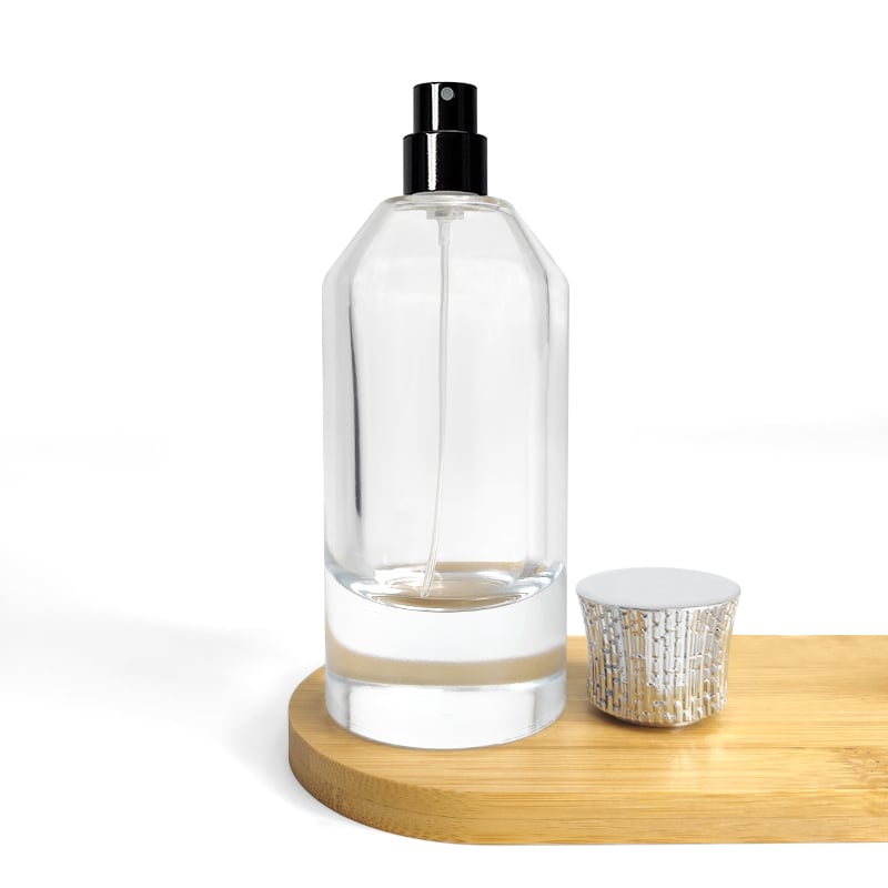
The Strategic Role of the Perfume Bottle in Brand Identity
In the fragrance industry, the perfume bottle serves as a silent ambassador—often making the first and most lasting impression before a scent is ever experienced. Industry research indicates that 55–60% of beauty purchase decisions are shaped by packaging, underscoring the bottle’s power to communicate luxury, sustainability, or innovation in a split second. A custom perfume bottle transcends mere containment; it becomes a tactile and visual extension of the brand’s ethos, encoding heritage, minimalism, or avant-garde creativity into its glass silhouette. When designed with intent, the bottle bridges the gap between a product’s olfactory promise and the consumer’s emotional expectations—building instant recognition and long-term loyalty. This strategic alignment transforms a functional object into a narrative device, allowing brands to convey their story without a single word. From the weight of the glass to the curve of the shoulder, every detail reinforces the identity the fragrance claims to embody. As a result, the bottle does not just hold a liquid—it anchors the brand’s position in a crowded market, ensuring that the visual and tactile experience remains as memorable as the scent itself.
Designing Perfume Bottles That Reflect Brand Personality and Audience Expectations
Shape, Scale, and Structure: Communicating Luxury, Minimalism, or Innovation
Shape, scale, and structure serve as silent ambassadors of a brand’s identity. A heavy, faceted bottle with a wide base and thick glass walls suggests opulence and permanence—commonly chosen by luxury houses to evoke enduring value. Curved, organic silhouettes reminiscent of teardrops or amphorae convey heritage and romance, while angular, geometric forms project confidence and modernity. Minimalist brands favor clean-lined cylinders or squares that reduce visual noise and spotlight the fragrance’s essence. Innovative labels break conventions with asymmetrical forms, nested structures, or kinetic elements that surprise and engage. Scale also signals intent: a grand 100ml flacon dominates a vanity and conveys importance; a compact, pocket-sized version denotes practicality and portability. These structural choices must captivate and serve the functional needs of the target audience—ensuring the bottle feels intrinsic to the brand story. Ultimately, the silhouette becomes a recognizable signature, as iconic as a logo. When customers reconnect with its shape, they instantly recall the brand’s promise.
Material and Finish Choices: Glass, Recycled Content, Weight, and Tactile Perception
Material and finish choices directly influence tactile perception and perceived value. Traditional perfume bottles rely on high-clarity glass for its premium look and chemical inertness—but sustainability-conscious brands increasingly adopt recycled glass, reducing carbon footprint without compromising elegance. Bottle weight functions as a psychological cue: heavier vessels imply luxury and substance, while lighter ones risk feeling disposable. Surface finishes add nuance—a glossy, polished surface exudes sophistication; a matte or frosted texture offers soft, contemporary appeal. Soft-touch coatings or metallic accents can elevate sensory engagement. According to a 2023 survey by a leading packaging research firm, 68% of consumers associate bottle weight with product quality. Subtle color shifts in recycled glass—once considered flaws—are now embraced as authentic markers of responsible design. This interplay between material and finish sculpts the brand’s tactile identity.
Color, Finish, and Visual Cues as Core Brand Signals in Perfume Bottle Design
Color, finish, and visual cues act as the first, silent handshake between a perfume bottle and its potential buyer. They telegraph brand values and fragrance personality long before the cap is lifted. A matte, frosted finish suggests understated elegance; a glossy, lacquered surface conveys bold luxury. These signals are processed in milliseconds—shaping expectations and driving purchase intent. Aligning them with the brand’s identity is a strategic necessity, not just a design detail. That alignment reaches its peak when color psychology and precise Pantone strategies are applied to evoke targeted emotional responses.
Color Psychology and Pantone Strategy for Targeted Emotional Resonance
The psychology of color in a perfume bottle taps directly into consumer memory and emotion. Deep violet signals mystery and opulence—ideal for evening-wear fragrances—while soft pastel pinks convey romance and tenderness for floral compositions. Research shows color alone can account for up to 85% of the reason a consumer chooses one product over another. Leading fragrance brands therefore apply Pantone standards rigorously across custom bottle lines. Specifying an exact Pantone shade ensures visual consistency—whether produced in Europe or Asia—reinforcing trust and emotional continuity. A cool, Pantone-matched cerulean blue evokes a fresh, aquatic escape; fiery crimson signals passion and intensity. Such targeted color strategies, harmonized with intentional finishes, create a bottle that speaks directly to the subconscious—driving shelf appeal, emotional resonance, and long-term brand loyalty.
Perfume Bottle as Narrative Device: From Unboxing to Shelf Presence
A perfume bottle is the first physical chapter of a fragrance’s story. The unboxing moment—lifting a lid, sliding a sleeve, revealing a heavy glass vessel—creates anticipation and ritual. Tactile details—cool glass, soft satin—turn a simple act into a sensory journey. This narrative extends from private unboxing to public shelf presence, where the bottle must command attention and convey brand values without words. Every contour, color, and closure builds a visual tale that engages consumers before the scent is experienced.
Caps, Closures, and Gradient Transitions as Storytelling Elements
A cap is not merely a lid—it is a punctuation mark in the bottle’s story. A magnetic closure that snaps shut with a satisfying click signals precision and luxury; a hand-carved wooden cap recalls natural origins and artisanal craft. The smooth glide of a pump or resistance of a heavy stopper can mirror the scent’s character—delicate florals or bold orientals. Gradient transitions, where color fades from one hue to another, imply a journey: a shift from fresh top notes to deeper base notes—or from daylight to dusk. Such gradients visually echo the fragrance’s evolution on skin. These visual and tactile arcs guide the user through the fragrance’s emotional landscape, making the bottle a mnemonic device that bridges the initial unboxing rite and lasting shelf presence.
FAQs
Why is a perfume bottle important for brand identity?
Perfume bottles act as silent ambassadors that visually and tactilely represent a brand's values, personality, and ethos, creating instant emotional connections and long-term consumer loyalty.
How do color and finish affect consumer behavior?
Colors and finishes evoke emotional responses, set expectations, and telegraph brand values. Research shows color can influence up to 85% of a customer’s purchase decision.
What materials are commonly used in perfume bottle design?
High-clarity glass is the traditional choice for its premium look and chemical inertness, though recycled glass is increasingly adopted for sustainability-conscious brands.
How can a perfume bottle design tell a story?
Elements such as caps, closures, gradient transitions, and tactile details create a sensory and emotional narrative that mirrors the fragrance’s character and journey.